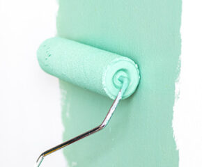
Colour is more than a lick of paint on the wall. It sets the mood in your home, influences how you feel and even says something about who you are. In this blog, we dive into the world of colour psychology and discover how the right colours can bring calm, energy or cosiness into your home. In this article, we tell you all about colour and the effect of colour.
What is colour psychology and why is it relevant in your home?
Colour psychology studies how colours influence our behaviour, emotions and perception. In an interior context, this means: how a colour makes you feel in a particular space. Just think how a soft green wall can calm you down, or how a warm terracotta shade makes a room cozier.
How does colour affect the atmosphere in your home? And how do you choose the right colour? In this article you can read how your choice of colour is related to your character, what certain colours evoke in you and in others, and how best to combine them in your interior.
We would like to give you one thing in advance: all colours can be beautiful, as long as they fit the context of your space. Dare to experiment with light, materials and visual balance. That way, you will discover for yourself the power of colour – and make your interior a place that really suits you.
The psychological significance of popular colours
In Ireland, natural and fresh shades are most popular, often inspired by the Irish landscape:
- Moss Green and Sage: bring tranquillity and a sense of connection with nature. Perfect for living rooms or bathrooms.
- Sky Blue: has a calming effect and opens up the space. Often used in bedrooms or kitchens.
- Creamy White (like RAL 9001): provides light and warmth, and is often combined with wood tones.
- Soft Clay: a warm, earthy shade that radiates security and authenticity
These colours are often chosen based on feeling and atmosphere rather than mere style. They help make a house a home.
What does your colour choice say about your personality?
Some people feel completely at home in shades of green, while others swear by warm earthy colours or powerful blues. Your personal preferences and favourite colour are often a mirror of your character. Do you like blue? Then perhaps you are someone who values calm and structure. Do you go for red or orange? Then you probably radiate energy and enthusiasm. If you choose neutral tones such as beige or grey, you are often looking for balance and simplicity.
You subconsciously translate these preferences into your interior. And that is precisely what makes your home so personal. Because the paint colour you choose is usually the one you get tired of least quickly. And that makes them ideal for living rooms, bedrooms or workplaces. Would you like to change colours or try out colours. Then paint a neutral colour on the walls and ceiling and use an accent colour (yellow, orange, purple,pink or another colour) for 1 wall, which you then keep changing.
Colour advice per room: from living room to bedroom
Every room in the house has a different function – and therefore a different colour requirement:
– In the living room, it is best to choose warm, inviting shades such as sand, taupe or olive green. They create cosiness and tranquillity.
– In the bedroom, soft colours such as light blue, lavender or greyish green have a calming effect and promote sleep.
– In the kitchen, things can be more lively. Think fresh whites like RAL 9016, soft yellow or an accent wall in terracotta.
– In the bathroom, natural colours like light grey or blue-green create a real spa feel.
– In the hall or corridor, choose light, fresh colours that make the room feel open and welcoming.
How to combine colours for a harmonious interior?
A successful colour palette is all about balance. Combine warm and cool shades, play with contrasts and take light into account. A colour that looks soft during the day can look much more intense in the evening or create an intimate atmosphere. Therefore, always first test a colour sample on the wall at different times of the day to see whether the chosen colour gives a nice effect and is the right colour.
Also dare to experiment with accents. A wall in a distinct hue can give a room that extra touch without being overwhelming.
What colour says about your interior – a short guide in colour psychology
🔴 The colour Red – power and passion
Red is a striking, warm colour that brings energy and fire into the home. It attracts attention, increases the heart rate and evokes feelings of love, power and sometimes danger. In interiors, red or dark red creates dynamism, but use it in moderation: one accent wall or a striking piece of furniture is often enough. Red suits people who sparkle with ambition and like to be the centre of attention.
⚪ The colour White – pure and spacious
Neutral colours such as white stand for purity, simplicity and light. It is the most frequently used colour in interiors, and rightly so: the colour white creates space, tranquillity and combines effortlessly with other shades. From pure white to off-white: each nuance has its own character. This colour always gives a calm look and a spatial effect. Ideal as the basis for a fresh, timeless interior and therefore the favourite colour of many a professional painter. Some nice Warm Whites are W23310 and ral 9001.
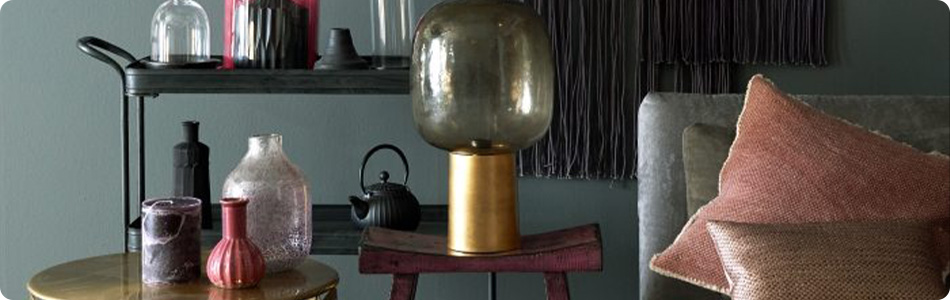
⚫ The colour Grey – balanced and stylish
Grey is versatile and neutral, but certainly not boring. Light tones such as soft greys bring warmth, while dark grey or anthracite can be just the thing to add a bold accent. Grey suits people who like tranquillity, structure and discretion. In interiors, it is a perfect background colour that allows another colour to shine.
🟡 The colour Yellow – active and optimistic
Yellow is the colour of sunlight, cheerfulness and creativity. It brings life into the home and instantly makes dark rooms more friendly. From soft pastel yellow to warm ochre: this cheerful colour combines surprisingly well with other colours such as brown, orange and the colour red. Ideal for those who like a positive, energetic atmosphere.
🟠 The colour Orange – warm and expressive
Orange is a mixed colour of red and yellow, exuding enthusiasm, warmth and spontaneity. In the interior, orange is a real mood creator, but also a colour that quickly dominates. So consciously choose accents or combine with natural materials for balance and the desired effect.
🟤The colour Brown – earthy and reliable
Brown is the colour of nature, of wood and earth. It radiates stability, calm and security. In interiors, shades of brown create a warm, inviting atmosphere. Think of a lighter colour such as sand, greige or cappuccino: perfect for those who love cosiness and authenticity. A darker shade of brown is fine as a warm base for warm shades in the interior.
🔵 The colour blue – calm and space
Blue is a cool colour that evokes feelings of calmness, confidence and clarity. Blue represents air and water, and has a calming effect on the body and mind. Ideal for bedrooms, bathrooms or workplaces where concentration is important. Dark blue, as a darker shade of blue exudes depth, while lighter shades of blue create a spatial effect with a fresh, open atmosphere.
🟢 The colour Green – balance and recovery
Green represents life, nature and balance. This colour represents tranquillity in the home and promotes harmony. In kitchens, offices or living spaces, green creates a refreshing effect. Combine different shades of green, like light green or olive green with natural materials for a lively but balanced interior.
🟣 The colour Purple – mystery and creativity
The colour purple is a powerful, spiritual colour that represents wisdom and imagination. For many people, purple is a bold colour. From soft lilac to deep violet, the colour purple always brings a warm, mysterious atmosphere. Perfect for those who love a unique, personal interior. Combine this warm colour with natural shades or pink for a soft, elegant look.
🌸 The colour Pink – softness and charm
The colour pink radiates tenderness, femininity and playfulness. Soft pink has a calming and warm effect, especially when combined with beige or brown. Bright pink accents add spice to a neutral interior. Ideal for those who like a soft, inviting atmosphere with a touch of daring. And know that pink really isn’t just for girls.
Common mistakes when using colour in the home
- Painting everything in one colour without contrast or nuance
- Not taking daylight and artificial light into account
- Combining too many bright colours without resting points
- Forgetting to match colours to furniture and floors
- Too many different cold colours
Colour makes your house a home
Colour is emotion, atmosphere and personality all in one. Every colour is unique. By consciously choosing colours that suit you, you can create an interior in which you really feel good. Whether you like peace, energy or cosiness – with the right colour in the right place, you can make your house a warm home.